Smartphone Users Use Devices More like Computers Than Phones, Study Reveals
Elf
Report by Counterpoint Research Reveals that Over Half of All Users Surveyed, Spend More than 5 Hours a Day on Smartphones
Counterpoint Research compiled global insights by pulling data from an extensive survey of 3,500 smartphone users aged 15-45 across the globe to better understand mobile user behavior, patterns, preferences and factors that influence purchasing decisions. Today, approximately half the world’s total population (7.6 billion users) uses smartphones. Annual spending exceeded $370 billon in 2017.
Time Spent Daily Using Smartphones

Image via Counterpoint Research
Since its introduction in 2007, the iPhone changed how users interacted with their phones and helped integrate varied, desired functionality into one device such as browsing the Internet, composing emails, taking photographs, sending text messages, making phone calls and playing games. Unlike prior smartphones where users still used the devices primarily for making phone calls, iPhones opened up opportunities for more computing and actual work functionality. Fast forward to today, smartphone users of both iPhones and other devices, use their smartphones for mobile computing activities primarily. Many dedicated users run businesses on their phones. Others consume digital content for hours.
Mobile User Behavior

Image via Counterpoint Research
The iPhone Brought Powerful Desktop Computing to A Small Screen
These consumer trends in many ways mirror Apple’s own foray into the smartphone world where the initial iPhone product in 2007 brought powerful desktop computing features into a portable, small device, including WiFi networking but was not necessarily the best mobile telephone at the time, given restrictions with carriers, shorter battery life and lagging in the trend in the next few years towards 3G and 4G Lite. However, the iPhone introduced the concept of apps to the world beyond computing professionals through the launch of the App Store and allowing third-party software to run code on iPhone devices. This sparked a tremendous revolution across industries, spurring innovation and new ideas, as well as offering developers the opportunity to create software on their own terms. Games were among the most popular apps initially and the quality of games on the iPhone was far superior to any other existing platform at the time because of the larger screen, graphics capability and computing power. Eleven years later, this dominance is still prevalent, although other platforms have also significantly improved and providing excellent mobile experiences. Other phone platforms such as Microsoft’s Windows Mobile were unable to compete after the launch of the iPhone as they failed to provide an enjoyable mobile user experience and functionality.

How the laptop combined the functionality of numerous office devices and applications

Essential laptop functionality is now available on your iPhone and other smartphones
Today, you can walk on any street in practically any neighborhood in the world and see a smartphone user engaging with content on their mobile device with focused attention. Smartphones are ubiquitous and offer consumers independence to search for information themselves, communicate directly wherever they are, work or entertain themselves.

Image via Apple
Preference for Mobile Sophistication and Ease of Use
The iPhone offered a smoother mobile browsing experience than any preceding smartphone when it launched. With the use of Notifications, the iPhone helped introduce users to simplified, faster communication updates, that Apple then rolled out to other mobile devices such as the iPad and for the Apple Watch, which does not use an independent web browser, but relies solely on apps.
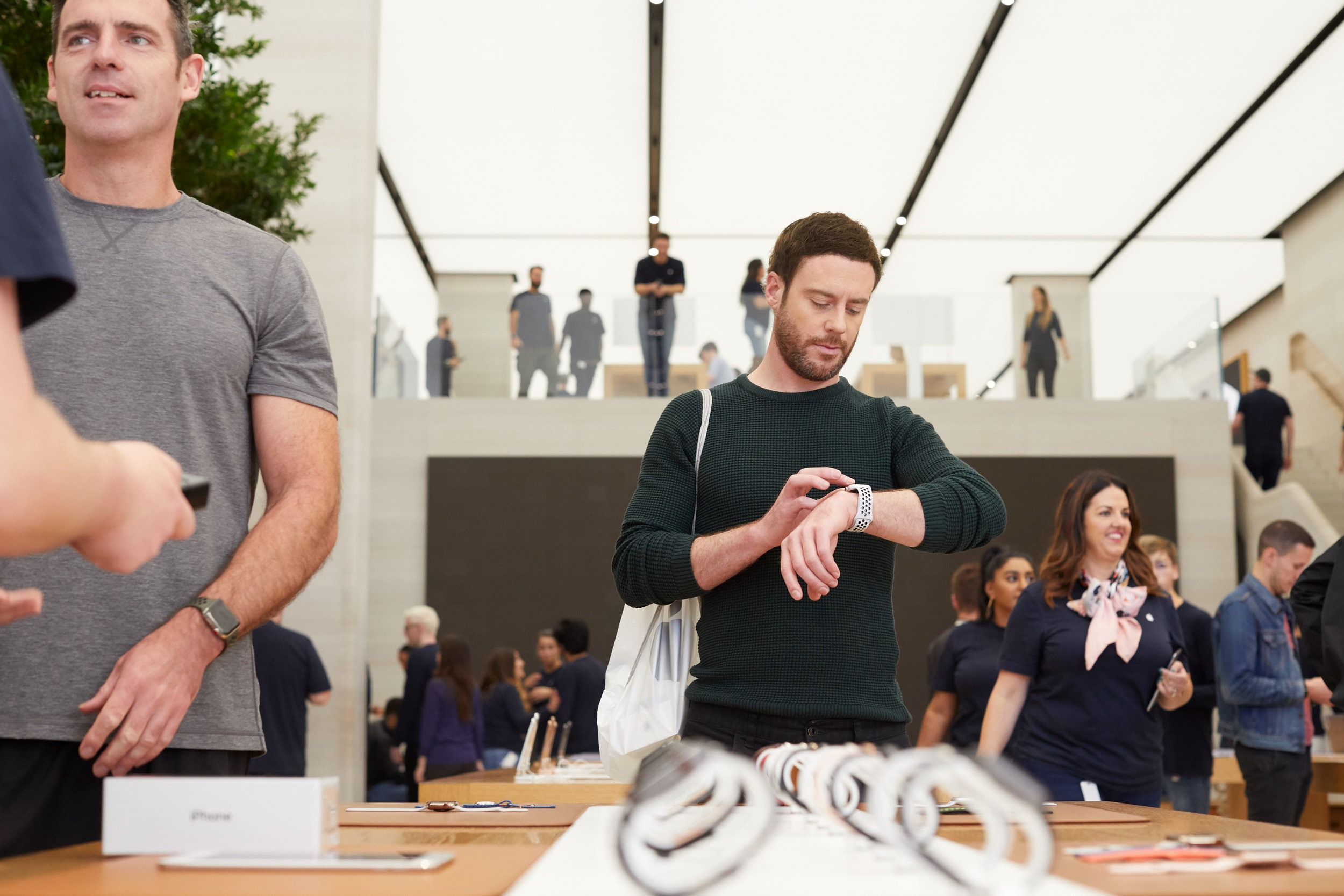
Image via Apple
This conscious choice by Apple to provide a simplified and distinct mobile computing experience helped win consumer loyalty due to an enhanced and enjoyable user experience. This was in sharp contrast to Microsoft’s effort to scale down its Windows PC platform to a mobile device through all of its iterations from Windows Mobile to Windows Phone, Window’s RT tablets and detachables. Despite its initial success with Surface, Microsoft has been unable to grow sales beyond a million devices per quarter - the same sales numbers the company garnered from a decade prior.
Google, on the other hand, succeeded in making the Android platform attractive to smartphone users by offering similar features to the iPhone. However, Google’s mobile computing efforts lag behind the iOS ecosystem for several reasons ranging from cybersecurity to providing streamlined mobile web browsing, lack of customization options, lack of development tools and by being very slow to attract and retain popular, exclusive games.
Smartphone users are looking for greater sophistication in their mobile devices and are thus willing to pay more for premium devices.
Demand for a Higher Quality, More Sophisticated Mobile Platform
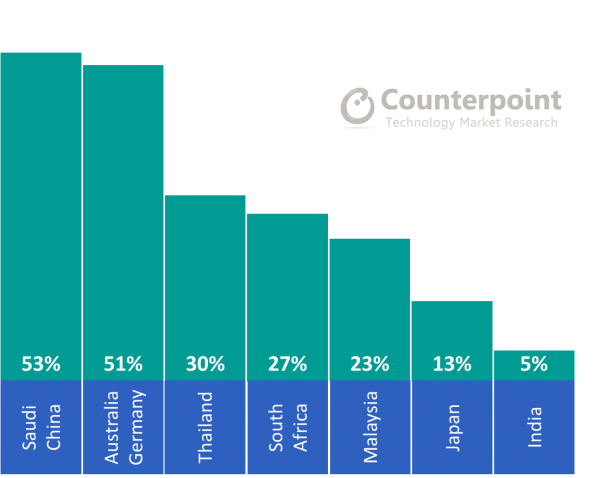
Image via Counterpoint Research
The report revealed that more than half of the Australian, Chinese, German and Saudi smartphone users are willing to spend more than US$400 to replace their current devices. Apple also dominated the user base in both Germany and Australia with as many as 85% of users insisting on brand loyalty.
Japanese users were less willing to spend more than $400 on new devices, despite Apple being the most popular smartphone brand in their country. This trend in Japan reflects cultural preference as Japanese consumers tend to be more conservative than consumers in other countries.
Also Japanese consumers tend to buy higher priced models and hold on to them longer (average of 26 months) as compared to Mexican consumers for example, that have the shortest life cycle of smartphones (average of 18 months or less). Over one-third of all Mexican consumers however purchase used smartphones. The smartphone replacement cycle has shortened significantly due to developing markets, which is also spurred on by the rise of newer Chinese brands that provide higher quality models at affordable prices than previously available. The report also revealed that as high as two out of three mobile users in India intend to upgrade to a newer phone within the next twelve months.
Shorter Smartphone Use Cycle Worldwide
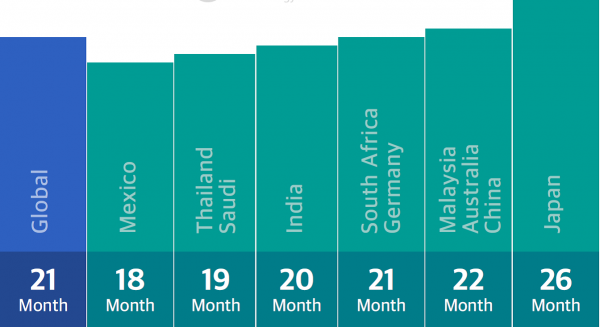
Image via Counterpoint Research
The report revealed that Apple was in the top three most sought out brands for purchase for all respondents. Roughly 50% of all survey respondents in developed countries also subscribe to digital streaming services, with Netflix in use by 30% of Australian users and 40% of German respondents using Amazon Prime.

Image via Apple
In addition, digital payment methods are increasing in popularity worldwide, particularly in China (AliPay and WeChat) and Thailand (True Money). This is due to their ease of use and ability to override gaps in financial infrastructure for many developing markets.